● Brand Guidelines
Our Brand
Built To Last.
Primary Logo.
01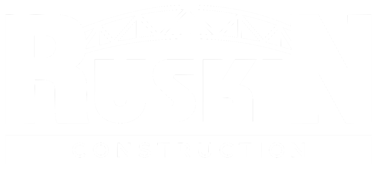
- Use the white logo on Ruskin Green or Charcoal only.
- Keep clear space equal to the height of the arch on all sides.
- Never stretch, recolour, rotate or add effects to the logo.
Bridge Icon.
02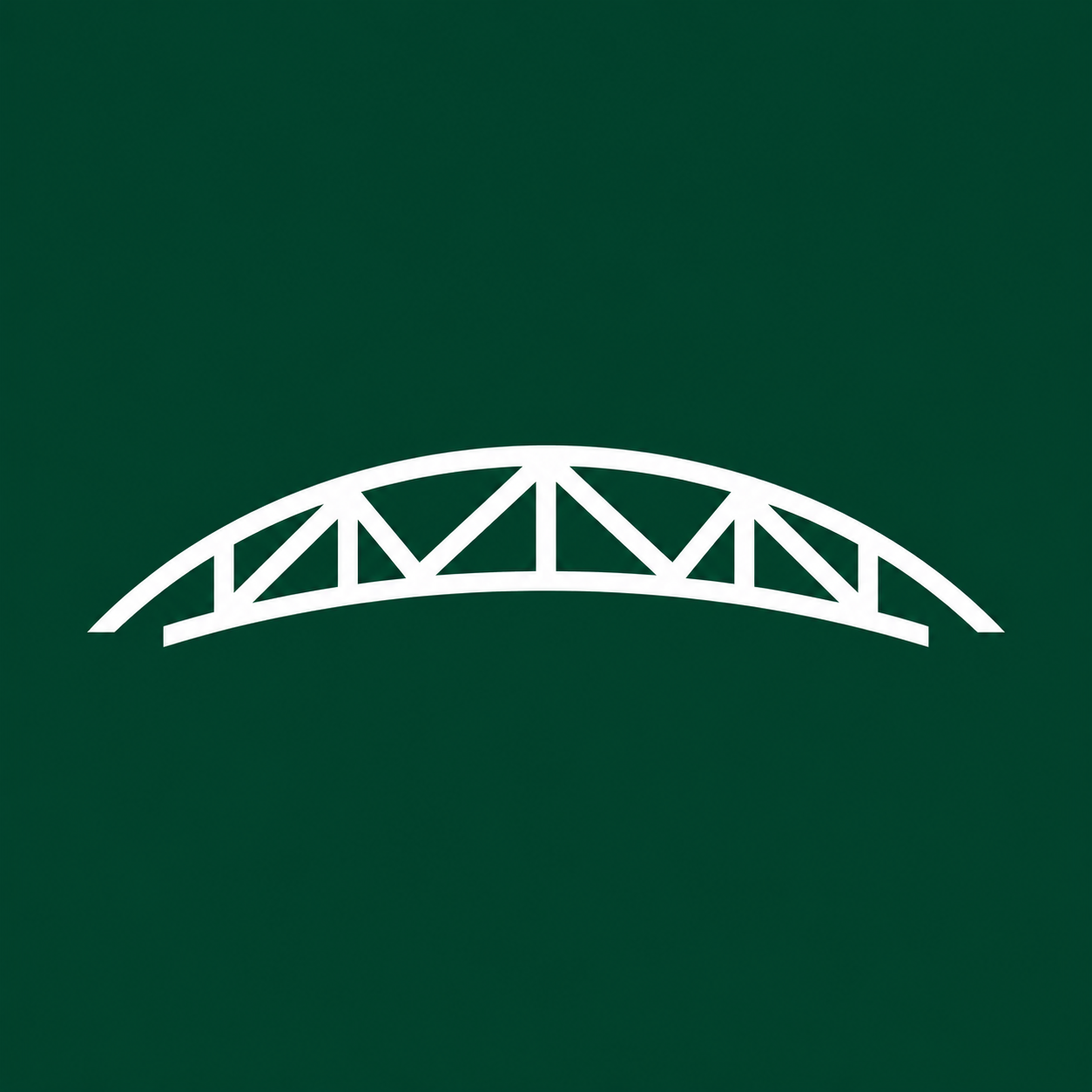
The truss-arch icon is used where the full logo won't fit — browser tabs, app icons and social avatars. Always place it on its Ruskin Green square.
Colour Palette.
03Ruskin Green
#062B20
Primary brand colour, backgrounds
Signal Lime
#B7FF20
Accents, rules, calls to action
Charcoal
#161816
Navigation, footer, dark surfaces
Concrete
#A7AAA7
Secondary headings, muted text
Site White
#F4F2EA
Page background, light text
Type System.
04Display — Archivo Medium
Aa
Building What Connects Us.
Title case, tight tracking, two-tone across two lines, ending with a coloured full stop.
Body — Inter Regular
Aa
A specialized contractor providing design-build, bridge, marine, foundation, railway and aerial pipeline construction throughout North America.
Used for paragraphs, captions and supporting text.
Brand Voice.
05Direct
Short, confident statements. Say what we build and where.
Proven
Lead with real projects, places and conditions — not adjectives.
Grounded
Plain words. People, places, possibilities.